The general impression, however, was somewhat smeared by the 1 hryvnia coin added in 1995. And in 2001, the issuer went further and introduced a new, better design:
Now there is no trace of the former image: the obverse is pinched in the frame of an allegedly ancient Russian ornament, the text part has acquired suspiciously primitive features, the composition has become dull stiffness, and the general aesthetics has some kind of pseudo-historical and even near-church tone. By the way, judging by the disturbing trends of recent years, pseudo-historicism is turning into a new cultural code of Kyiv, dictating aesthetic canons in areas from architecture to banknotes.
But someone important definitely liked this decision – and already in 2018, all the latest hryvnia coins inherited it, which, to everyone’s horror, will soon become the only way to pay for seeds and travel in a minibus. About them, in fact, we are talking about:
And here everything not only remained bad – everything became noticeably worse. So much worse that their inexpressiveness, bordering on wretchedness, is obvious even to a spectator not gifted with a developed aesthetic taste, and strange in their ill-conceived decisions cast serious doubt on the professionalism of the authors. And here’s what I mean:
Extremely rough work with text, especially conspicuous in numbers: a mechanically stretched unit on a one-hryvnia coin causes almost physical pain (compare 1 and 10). Backward and uninteresting fonts against this background seem more like a minor flaw.
Primitive and some sloppy portraits on the reverse, reminiscent of school drawing lessons. Only there you could meet the shriveled Khmelnitsky without a neck or the Jesus-like Vladimir with the expression on the face of Mona Lisa – but certainly not on the monetary units of the whole country. The three-quarter angle is a risky choice in itself, because the profile in numismatics looks much more advantageous, and the chance to screw up with other angles is extremely high. Finally, what are these people doing here anyway? Do they really belong here? We will return to this.
The already mentioned helpless composition and aesthetics, best described by the word “clumsy”: stiff texts, boring ornamentation, some kind of pathological fixation on symmetry. The latter, by the way, is typical for our latitudes, as if symmetry is a synonym for beauty, although this is not so, to put it mildly, and later we will see that many of the strongest coins in terms of design are asymmetrical.
To top it all, the authors have made zero efforts to make at least some visible differences in different denominations. Okay, pennies, but why make such identical hryvnias? In addition to a weak visual range, this is also fraught with very unpleasant errors in the calculations.
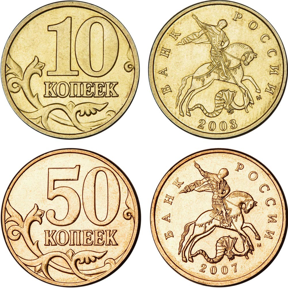
Do all coins look the same? What can go wrong? A similar failure from the technical side: the dimensions, materials and color, if not identical, then as close as possible, although what prevented making at least a gold piece “copper”, not to mention the double composition? The savings here are doubtful, the cons are not illusory. And a weak attempt to give an angular outline to the edge of the five, unfortunately, hardly solves the problem.
Speaking of savings: for the sake of it, and also to make life extremely difficult for the layman, the NBU also reduced all the coins to ridiculous sizes compared to the original sample of 2001, comparable rather to kopecks. As a result, even the new Chevrolets came out less than the old hryvnia, as if symbolizing the success of the regulator’s monetary policy.
How about others?
To understand the nature of this resentment and appreciate how bad things are, let’s look at examples of other people’s coins. the most common, mass-circulated coins, and not collection series, where authors compete in originality, although the border is sometimes arbitrary. The best site in the world will serve as an indispensable assistant to us on this journey, bringing together on one page almost all territories with their own currency, including Pridnestrovian and Somaliland
Looking ahead, I’ll say that not all coins are good, and even more so, lousy examples are much more common than worthy ones. And yet the second is not uncommon! But before we get an idea of the big picture, let’s go through the key characters first and start, of course, with the Euro. On the front side, they are quite uncomplicated, although, admittedly, they are not without style:
The graphics here are rather for an amateur, but one cannot fail to note, firstly, the stylistic unity, and secondly, the difference in size and materials, which makes it possible to accurately distinguish coins of different denominations and even orders.
If the reverse is the same in all countries, then with the obverse, the participants were given full autonomy, which they used with varying degrees of success:
Someone (Belgium, Ireland) was extremely stingy, and someone (France, Italy) showed everything he was capable of, but we can say that the majority approached the matter wisely. Missing in the picture, the newly minted members of the eurozone are generally holding their own (Latvia), though not without flops (Cyprus). The motifs here are dominated by portraits, heraldry and architectural objects – themes, as we will later find out, are dominant in most other countries.
In the USA, they took a different path and did not adhere to any style at all in coins. Fonts, materials, sizes and even angles do not show even the slightest signs of submission to a single idea, apart from the portraits on the obverse, and even they are staring in different directions: